Rank your menu by contribution margin in pounds, then cross-check that against menu mix. Food cost percentage still matters, but only as a whole-menu health check, never as the number that decides an item’s fate. If you do nothing else this week: pull the last 30 days of item sales from your till reports, cost your top 10 sellers properly, and work out what each one actually earns you in cash per plate.
TL;DR:
- Focus on contribution margin in pounds for menu item decisions, as it directly reflects cash earned rather than relying solely on food cost percentages.
- Use the menu engineering matrix to classify items into stars, plowhorses, puzzles, or dogs based on contribution margin and popularity, guiding targeted changes.
- Prioritize fixing plowhorses with small pricing or portion adjustments before addressing puzzles, which need better visibility or description.
- Conduct monthly analysis for high-turnover venues and immediately after recipe or pricing changes to prevent high-margin items from slipping into lower-profit categories.
- Regularly track key KPIs such as contribution margin per cover, menu mix, plate-cost variance, and attachment rate, using these metrics for continuous menu optimization.
Table of Contents
- What are the key menu engineering metrics?
- How does the menu engineering matrix classify items?
- How do you calculate contribution margin and menu mix?
- Turning the matrix into menu changes that actually work
- How often should you re-run menu engineering?
- A practitioner’s shortcuts for one-shift menu reviews
- Why contribution margin beats the conventional wisdom
- Sources
- FAQ
What are the key menu engineering metrics?
Four numbers do almost all the work in menu engineering. Get these right and everything else, from plating decisions to server scripts, follows naturally.
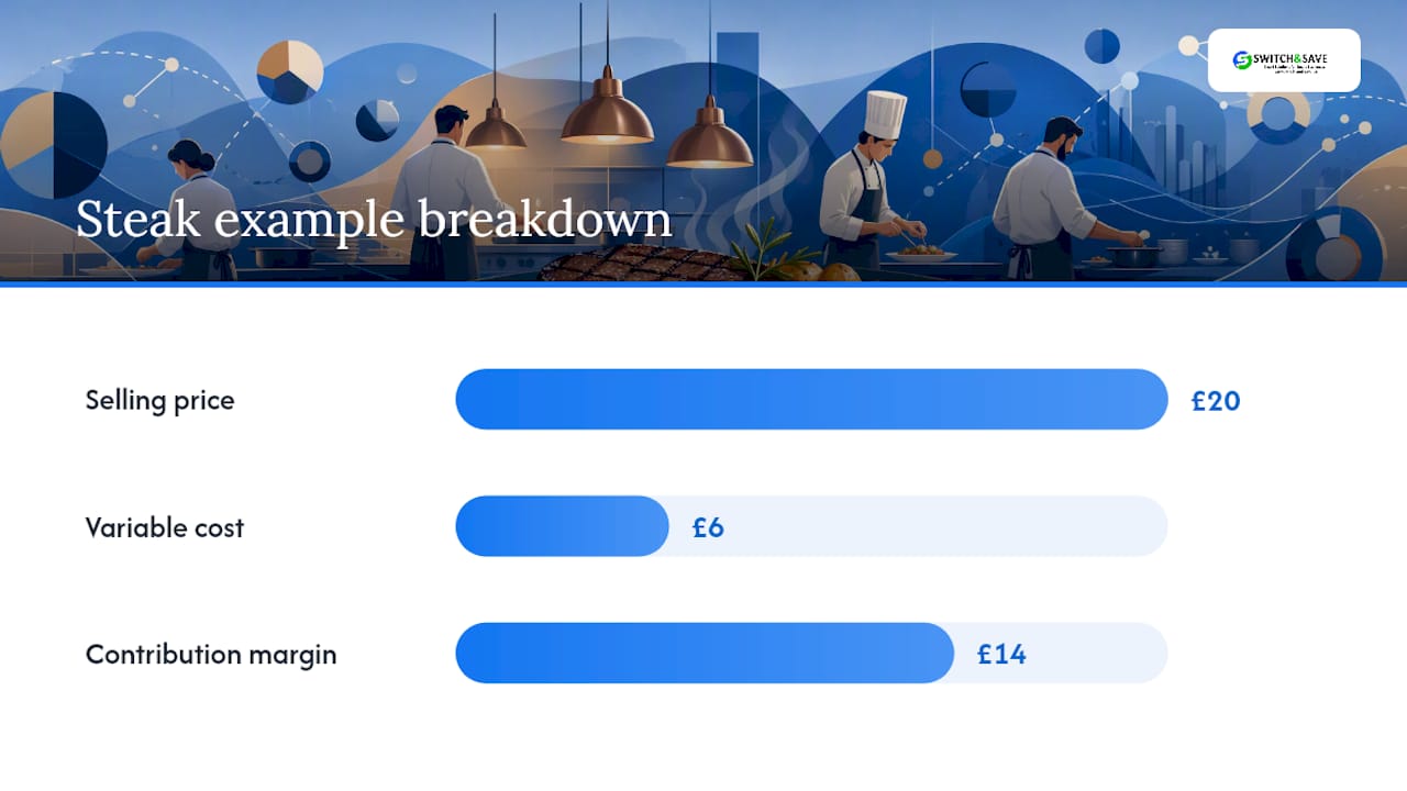
Food cost percentage is your ingredient cost divided by the selling price, multiplied by 100. A steak costing you £6 to plate and selling at £20 runs a 30% food cost. Most sit-down restaurants aim for somewhere between 28% and 35% across the whole menu, though that band shifts by cuisine and format. Treat it as an aggregate P&L check, a way to see if your overall buying and pricing are sane, not as the metric you use to judge one dish against another.
Contribution margin in pounds is the number that should decide item-level choices. It’s simply selling price minus variable cost. That steak at £20 with a £6 cost gives you £14 of contribution margin, whatever the percentage says. Contribution margin in monetary terms consistently beats food cost percentage as a decision metric because your landlord and your payroll provider want pounds, not ratios.
Menu mix percentage, sometimes called sales mix, tells you how popular an item is relative to everything else you sell. Divide the number sold by total covers sold across the period. A common threshold is 70% of what an item would sell if all items were equally popular, though many operators simplify this to “average sales across the menu.”
Plate-cost variance compares what a dish should cost on paper against what it actually costs once portioning, waste, and substitutions are factored in. Tracking contribution margin, menu mix, plate-cost variance, labour efficiency, and attachment rate together exposes exactly where margin leaks rather than leaving you guessing.
Two secondary KPIs are worth watching once the core four are bedded in:
- Attachment rate — how often a starter, side, or drink gets added to a main course order.
- Category margin — total contribution margin generated by a whole menu section (starters, mains, desserts), useful for spotting a weak category before it drags down the entire menu.
In pounds, that salad might earn you £3.40 and the steak £19. Guess which one you should be pushing harder.*
How does the menu engineering matrix classify items?
The matrix plots every dish on two axes: contribution margin in pounds on one, popularity (menu mix %) on the other. Work out your menu’s average CM and average popularity first, then every item lands in one of four boxes relative to those two lines.
- Stars — high CM, high popularity. Protect these. Keep the recipe, keep the price, keep the position on the page.
- Plowhorses — low CM, high popularity. Popular but not earning much per plate. These need a price nudge or a cheaper build, not a menu exit.
- Puzzles — high CM, low popularity. Profitable but hidden. These need visibility: better placement, a stronger description, or a server prompt.
- Dogs — low CM, low popularity. Neither loved nor profitable. Candidates for removal or a total rework.
The four-quadrant framework, built from sales data, food costs, and contribution margins, sits at the centre of menu engineering because it forces a decision on every single item rather than a vague sense that “the burger sells well.”
Priority order matters more than most operators realise. Fix Plowhorses before you touch Puzzles, since a small price or portion change on a high-volume item moves more total pounds than perfecting a rarely-ordered one.
How do you calculate contribution margin and menu mix?
Before any spreadsheet work, gather four things: POS sales counts by item for a proper window, current recipe costing sheets, up-to-date supplier unit costs, and a realistic waste allowance. Include modifier and comp data too, because a “free side” logged against the wrong item will quietly wreck your numbers.
- Cost the recipe. Add every ingredient at its current supplier unit cost, portion by portion, including sauces and garnish. Don’t round down on small items; they add up across hundreds of covers.
- Calculate contribution margin. Selling price minus that total recipe cost, in pounds.
- Calculate food cost %. Recipe cost divided by selling price, multiplied by 100, kept purely as your benchmark check.
- Calculate menu mix %. Units sold for that item divided by total units sold across the period.
- Plot against your averages and read off the quadrant.
Here’s a three-item example over a 30-day window:
| Item | Price | Cost | CM (£) | Food cost % | Units sold |
|---|---|---|---|---|---|
| Fish pie | £16 | £4.80 | £11.20 | 30% | 210 |
| Mushroom risotto | £13 | £2.60 | £10.40 | 20% | 60 |
| Chicken burger | £12.50 | £4.75 | £7.75 | 38% | 340 |
Sorted by contribution margin, the fish pie earns almost the same per plate and sells three times as often, making it the real Star. This is precisely the trap food-cost-percentage sorting creates: a low percentage on a low-cost, low-volume dish can look impressive while quietly contributing very little to the till.
Watch for indirect variable costs, packaging on takeaway orders especially, and decide upfront whether they’re folded into the recipe cost. Where your EPOS system already produces menu mix and CM reports automatically, use them; recalculating by hand every month invites errors and eats hours you don’t have.
Turning the matrix into menu changes that actually work
Classification is only useful once it changes something on the floor or on the page. Work through items in this order: protect your Stars, fix one Plowhorse, test one Puzzle, and only then decide what to do with Dogs.
- Stars stay exactly where they are on the page, ideally boxed or highlighted, since visual weight sells dishes on its own.
- Plowhorses get a small price increase, a slightly smaller portion, or a cheaper garnish swap, tested one at a time so you can see what moved the number.
- Puzzles get moved higher on the page, given a richer description, or added to a server’s suggestive-selling script (“Have you tried the lamb shank tonight?”).
- Dogs either get reworked with a cheaper build or dropped at the next reprint.
Repositioning high-contribution items and training staff to suggest them, rather than rewriting whole recipes, has lifted category contribution by 5 to 12% within a single quarter in cited cases, which tells you the biggest wins often come from cheap, low-risk changes rather than a full menu relaunch.
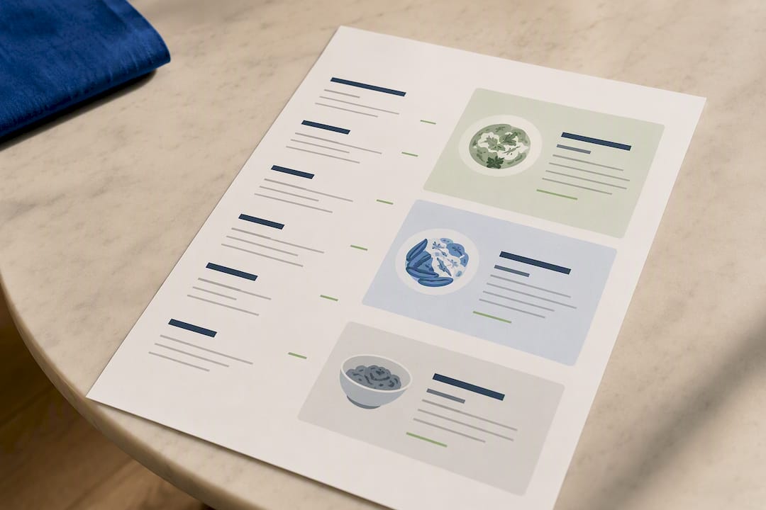
Menu design tricks that genuinely move the needle: put your two or three best-margin items in the top-right of the page or the first thing a diner reads, box or shade the ones you want noticed, and swap generic names for descriptive ones (“slow-braised lamb shank” outsells “lamb shank”). Some of these presentation principles carry over directly from good visual hierarchy in online sales pages, where the same eye-tracking logic applies to a printed page.
Pro Tip: *Never raise a price purely because food cost % looks high.
Back it up operationally: retrain staff on the actual recipe, weigh a sample of portions against the spec sheet, and reconcile supplier invoices against usage so your costs aren’t drifting silently.
How often should you re-run menu engineering?
Run the full analysis monthly if you’re a fast-serve or high-turnover concept, quarterly if you’re a stable, low-change menu. Re-run it immediately, outside the normal cycle, whenever you change a price or a recipe, since that’s exactly when a Star can quietly slide into Plowhorse territory.
Between full reviews, keep an eye on:
- Total food cost % against your target band
- Average contribution margin per cover
- Category margin by menu section
- Attachment rate on starters, sides, and drinks
- Plate-cost variance against recipe spec
- Labour minutes per item, particularly for anything with heavy prep
Compare a simple “before and after” window, two to four weeks either side of a change, and look for a difference large enough to matter in pounds, not just a statistical wobble. A well-built EPOS dashboard can surface most of these automatically, which turns a monthly spreadsheet chore into a five-minute check.
A practitioner’s shortcuts for one-shift menu reviews
Recipe costing is the single biggest time sink in menu engineering, and it’s usually where accuracy falls apart first. Some EPOS systems link live stock levels to sales data, which speeds up sales-to-stock reconciliation considerably, since you’re not manually cross-referencing a spreadsheet against a stock count at month end.
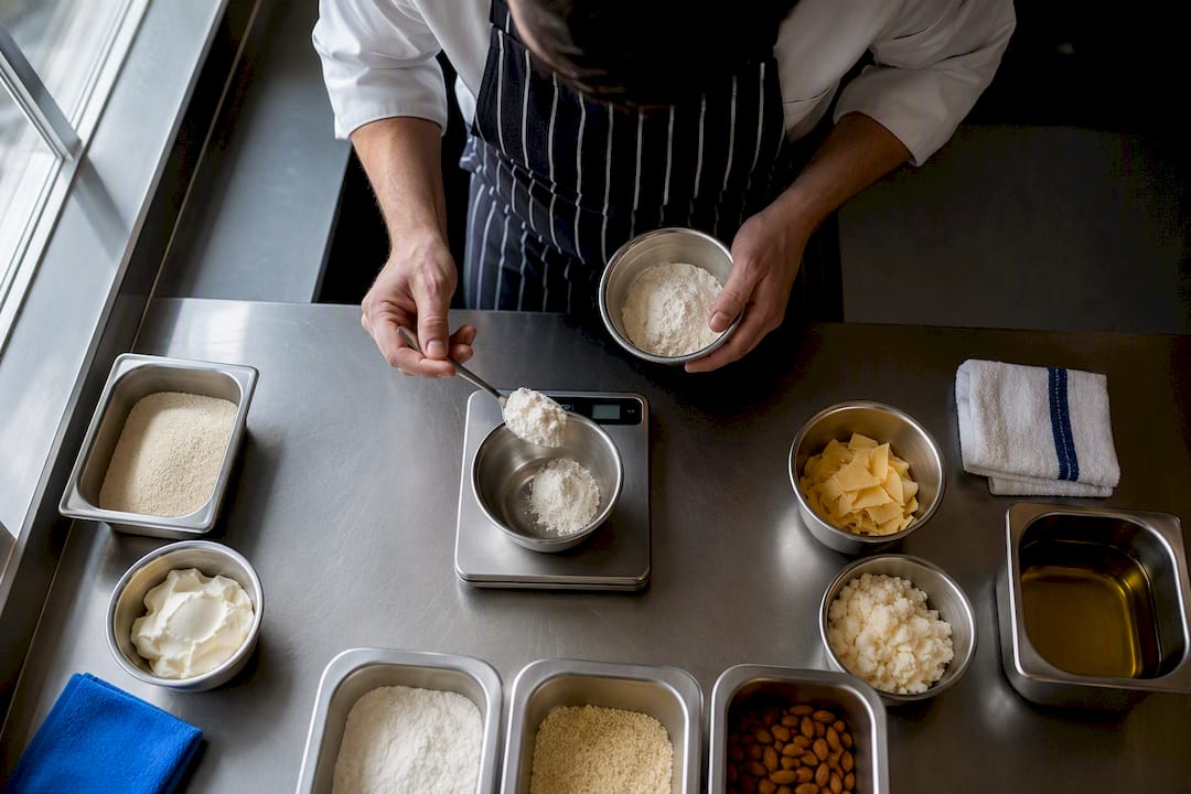
Two shortcuts worth adopting immediately: use tare-weighted portions for anything scooped or poured (sauces, rice, dressings) rather than guessing, and pull stock depletion reports weekly rather than monthly so drift gets caught before it compounds. EPOS-linked stock tracking makes both far quicker than a manual count.
A printable one-shift checklist:
- Pull 30 days of item sales by count
- Cost the top 10 sellers accurately
- Calculate CM and menu mix for each
- Plot against menu averages
- Flag one Plowhorse and one Puzzle to act on this week
Why contribution margin beats the conventional wisdom
Most menu advice still leans on food cost percentage because it’s easy to explain and easy to benchmark against industry norms. That’s exactly its weakness. A percentage flatters cheap, low-volume dishes and quietly punishes the high-ticket items that actually keep the lights on. The conventional wisdom treats food cost % as a diagnostic tool for individual dishes when it was only ever designed as a whole-menu health check.
What the evidence in this guide actually supports is narrower and more useful: rank by contribution margin in pounds, cross it against popularity, and let the matrix tell you where to spend your limited attention. Puzzles get overlooked constantly, not because operators don’t know they exist, but because fixing a popular Plowhorse feels more urgent. It usually isn’t, in pounds terms.
Prioritise the boring, repeatable habit over the clever one-off fix: cost your top sellers properly, every month, and let the quadrant do the thinking. Even an 8 to 12 item menu can see meaningful margin lift if the operator is rigorous about it. Rigour, not sophistication, is what separates the restaurants that improve from the ones that just reprint the same menu with new prices.
— Amir
Sources
Bookmark the menu mix and profitability matrix framework alongside your recipe sheets. Keep a running audit trail of every costing change, since that history is what tells you whether a price move actually worked.
- Contribution Margin vs Food Cost Percentage (Why Food Cost % Lies)
- How Menu Engineering Creates Profitable Menus
- Menu Performance Metrics That Matter
FAQ
What KPIs should restaurants track for menu performance?
The core set is total food cost percentage, average contribution margin per cover, category margin, attachment rate, plate-cost variance, and labour minutes per item. Together these show both how the whole menu is performing and where individual dishes are leaking margin.
What are the main menu pricing methods?
Common approaches include cost-plus pricing (a fixed markup on food cost), competitor-based pricing, psychological pricing, value pricing based on perceived worth, contribution-margin-based pricing, bundle or set-menu pricing, and demand-based or dynamic pricing for peak periods. Most independent operators do best combining cost-plus with a contribution-margin check, rather than relying on food cost % alone.
What is the 30/30/30 rule in restaurants?
This is commonly used as a rough cost-allocation guide, roughly a third of revenue to food cost, a third to labour, and a third to overheads and profit, though the exact split varies widely by concept and location. It’s a starting benchmark for budgeting, not a substitute for item-level contribution margin analysis.
How often should I run a menu engineering review?
Monthly for fast-serve or high-turnover concepts, quarterly for stable menus, and immediately after any price or recipe change. Waiting longer risks a Star quietly sliding into Plowhorse territory without anyone noticing.
Why does contribution margin beat food cost percentage for menu decisions?
Contribution margin in pounds reflects what actually lands in the till per dish, while food cost percentage can make a cheap, low-volume item look better than a genuinely profitable high-ticket one. Landlords, suppliers, and payroll all get paid in pounds, not percentages.